Flutter Stack Widget: Overlay & Position Widgets Tutorial (2026)
Last Updated: | Author: Deep Singh
Most Flutter layouts are one-dimensional in how they arrange children — a Column stacks vertically, a Row stacks horizontally. But sometimes you need widgets to sit on top of each other: a badge over an icon, a caption over an image, a floating button over a map.
That's where the Stack widget comes in. In this tutorial, you'll learn how Stack, Positioned, and Align work together to create layered layouts — with a complete working example you can run right away.
What is a Stack Widget?
A Stack is a widget that lets you place multiple children on top of each other in a single layout. The first child in the list is at the bottom, and each subsequent child is drawn on top of the previous one. So the last child in the list appears on the very top of the visual stack.
The size of the Stack is determined by the largest child that isn't positioned. If you don't wrap the Stack in a sized container, it will size itself to fit its un-positioned children.
Positioned vs Align
When you want a child inside a Stack to sit at a specific spot instead of centering by default, you have two tools:
- Align — positions a child at one of nine anchor points (top-left, center, bottom-right, etc.). It's simple but always pins the child flush to the edge of the Stack.
- Positioned — gives you explicit control with
top,bottom,left, andrightoffsets. This is what you'll usually want when you need pixel-precise placement, like "20 pixels from the left edge."
You can think of Positioned as Align plus Padding in one widget. If you've ever written Align(alignment: Alignment.topRight, child: Padding(padding: EdgeInsets.all(20), child: ...)), you can replace that with a single Positioned(top: 20, right: 20, child: ...).
Rule of thumb: Use Align for simple corner positioning, and Positioned when you need a specific offset from an edge.
The Full Code
Here's a complete working example. It layers four icons at the corners, then stacks three colored containers of decreasing size on top of each other, each with a banner label.
import 'package:flutter/material.dart';

void main() {
    runApp(const MaterialApp(
        debugShowCheckedModeBanner: false,
        home: StackDemo(),
    ));
}

class StackDemo extends StatelessWidget {
    const StackDemo({super.key});

    @override
    Widget build(BuildContext context) {
        const gold = Color.fromRGBO(218, 165, 32, 1.0);

        return Scaffold(
            appBar: AppBar(
                title: const Text('Stack Widget Tutorial'),
            ),
            body: Center(
                child: Stack(
                    children: [
                        // --- Icons at the corners ---
                        const Positioned(
                            left: 20.0,
                            top: 0.0,
                            child: Icon(
                                Icons.monetization_on,
                                size: 36.0,
                                color: gold,
                            ),
                        ),
                        const Positioned(
                            right: 20.0,
                            top: 0.0,
                            child: Icon(
                                Icons.monetization_on,
                                size: 36.0,
                                color: gold,
                            ),
                        ),
                        const Positioned(
                            left: 20.0,
                            bottom: 20.0,
                            child: Icon(
                                Icons.monetization_on,
                                size: 36.0,
                                color: gold,
                            ),
                        ),
                        const Positioned(
                            right: 20.0,
                            bottom: 20.0,
                            child: Icon(
                                Icons.monetization_on,
                                size: 36.0,
                                color: gold,
                            ),
                        ),

                        // --- Stacked containers, smallest on top ---
                        Center(
                            child: Container(
                                width: 200,
                                height: 200,
                                color: Colors.red,
                                child: const Banner(
                                    message: 'Bottom',
                                    location: BannerLocation.topStart,
                                ),
                            ),
                        ),
                        Center(
                            child: Container(
                                width: 150,
                                height: 150,
                                color: Colors.green,
                                child: const Banner(
                                    message: 'Middle',
                                    location: BannerLocation.topStart,
                                ),
                            ),
                        ),
                        Center(
                            child: Container(
                                width: 100,
                                height: 100,
                                color: Colors.yellow,
                                child: const Banner(
                                    message: 'Top',
                                    location: BannerLocation.topStart,
                                ),
                            ),
                        ),
                    ],
                ),
            ),
        );
    }
}
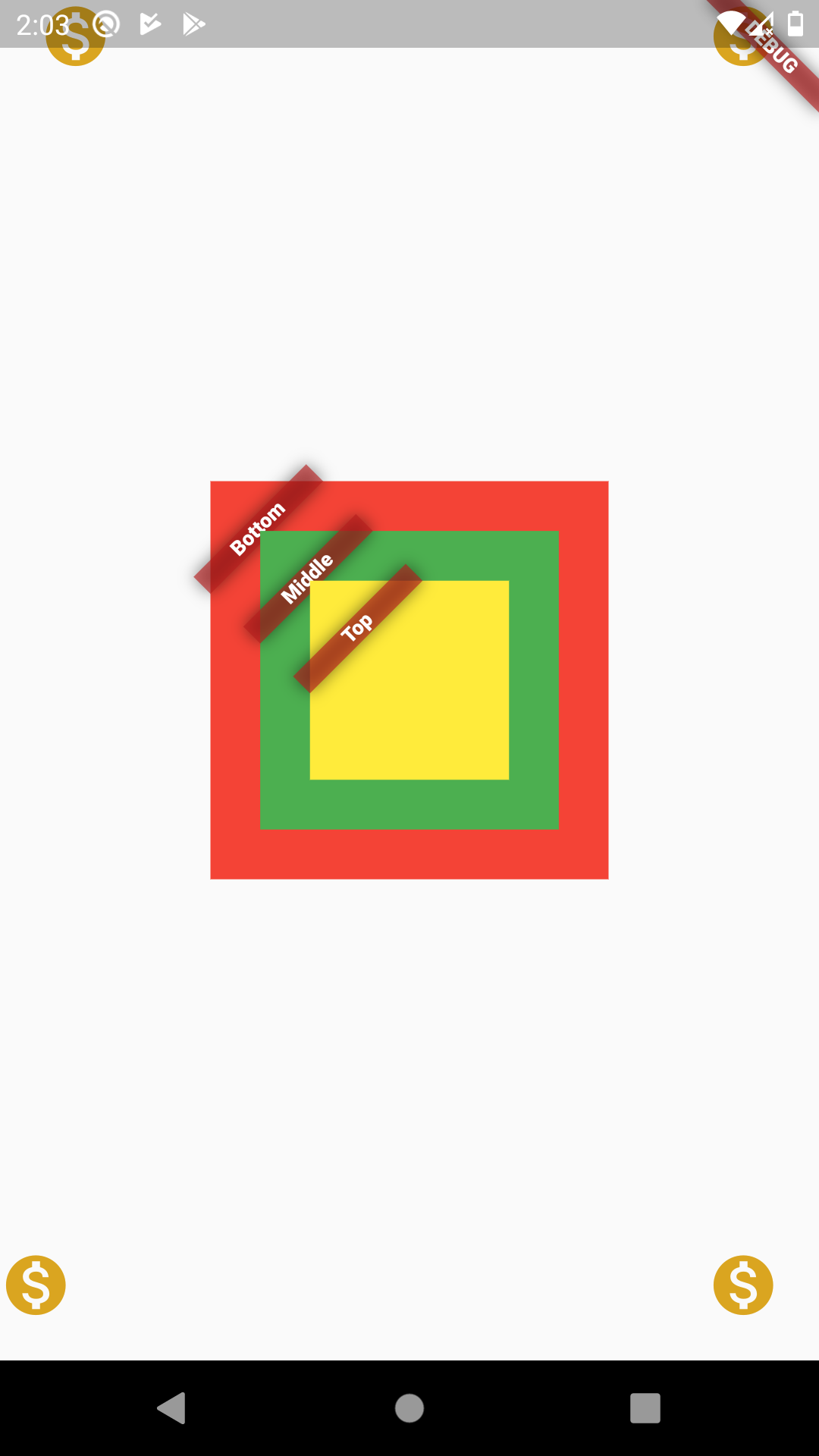
What you'll see: A red 200×200 square with a "Bottom" banner at its top-left corner. A green 150×150 square sits on top of it, and a yellow 100×100 square sits on top of that. Four gold coin icons sit at the corners of the Stack.
How the Code Works
Let's break down the important parts.
1. Stack Order Matters
The order of children in the children list determines the visual stacking. The first child is drawn first (bottom of the pile), and the last is drawn last (top of the pile). That's why in our example the red container appears behind the green, which appears behind the yellow.
2. Positioned with Absolute Offsets
Positioned(
    left: 20.0,
    top: 0.0,
    child: Icon(Icons.monetization_on, ...),
)
Positioned pins its child to the specified edges. Setting left: 20 and top: 0 places the icon 20 pixels in from the left edge, flush against the top. The right and bottom values are unset, so the icon isn't constrained from those sides.
3. Center for Symmetrical Placement
When we want a child in the middle of the Stack, we don't use Positioned — we use a plain Center widget. The Stack will honor its sizing and center it in the available space. This is often easier than trying to compute exact pixel offsets.
4. Banner as a Visual Label
Banner is a small widget that paints a diagonal ribbon in the corner of its parent. It takes a message and a location (top-left, top-right, bottom-left, or bottom-right). We use it here to make it obvious which layer each container belongs to.
5. The Stack Fits Its Children
Because the Stack is wrapped in a Center inside the Scaffold body, and none of its children are expandable, the Stack shrinks to the size of its largest un-positioned child (the 200×200 red container). The icons, being Positioned, don't affect the Stack's size — they're absolutely placed within the available area.
Common Stack Variations
Once you understand the basics, the Stack becomes a powerful tool. Here are the variations you'll use most often:
StackFit.expand
By default, un-positioned children get sized to their intrinsic size. Add fit: StackFit.expand to make them fill the entire Stack. This is useful when you want a background image or gradient to cover the whole area.
Stack(
    fit: StackFit.expand,
    children: [
        Image.network('https://example.com/cover.jpg', fit: BoxFit.cover),
        Center(child: Text('Overlay Text', style: TextStyle(color: Colors.white))),
    ],
)
Alignment for the Whole Stack
The Stack has an alignment property that defaults to top-left. Set it to Alignment.center if you want un-positioned children to center by default — though most people just wrap them in a Center instead.
Overlay with a Circular Avatar
Stack(
    children: [
        Container(width: 100, height: 100, color: Colors.blue),
        const Positioned(
            right: 0,
            bottom: 0,
            child: CircleAvatar(
                radius: 14,
                backgroundColor: Colors.white,
                child: Icon(Icons.check, size: 16, color: Colors.green),
            ),
        ),
    ],
)
This pattern — a small checkmark or badge over a larger element — is one of the most common uses of Stack in real apps.
Stack with an Image and Text Overlay
Stack(
    children: [
        Image.network('https://example.com/hero.jpg'),
        const Positioned(
            left: 16,
            bottom: 16,
            child: Text(
                'Hero Caption',
                style: TextStyle(
                    color: Colors.white,
                    fontSize: 24,
                    fontWeight: FontWeight.bold,
                ),
            ),
        ),
    ],
)
Perfect for hero banners, product images, and photo galleries.
Floating Action Button Over a Map
If you've ever wanted a "recenter" button over a Google Map, that's a Stack too:
Stack(
    children: [
        GoogleMap(/* ... */),
        Positioned(
            right: 16,
            bottom: 80,
            child: FloatingActionButton(
                onPressed: () {},
                child: const Icon(Icons.my_location),
            ),
        ),
    ],
)
Wrapping Up
The Stack widget is your go-to tool whenever you need to layer widgets on top of each other. Combined with Positioned, it gives you pixel-perfect control over placement — badges, overlays, floating buttons, custom UI compositions, and animated transitions.
A few things to keep in mind:
- Order is everything. The last child in the list is drawn on top. Put backgrounds and base layers first, foreground elements last.
- Use Positioned for precision. If you need "20 pixels from the left", use Positioned. If you just want "in the top-right corner", Align is fine.
- Watch out for unbounded constraints. A Stack inside a Column without a size constraint can throw layout errors. Wrap it in a Container with a defined size, or use
StackFit.expand. - Don't nest too deeply. Stacks within Stacks within Stacks make layout hard to reason about. If it's getting complicated, consider rebuilding with a custom
MultiChildLayoutDelegate. - Hit testing goes top-down. Taps hit the topmost widget first. If a Positioned child is transparent to touches, use
IgnorePointerto let taps pass through.
No comments:
Post a Comment